新作 | 深圳海境界展厅:心之所向,如是所安
我想,总会有那么一个人,如我一样,站立在天地之间,我们隔着时空的距离,对视、共鸣。而这,于我便也足够。——《消失的地平线》
深圳蛇口,新型社区的建设方兴未艾。一街之隔的海境界一期和二期,相距五载,旧的尚未老去,新的已然升起。视乎对比的视角,新与旧之间相对存在,如何建立一种有效的联系,以化解“旧”的尴尬局面和呈现“新”的生活憧憬?
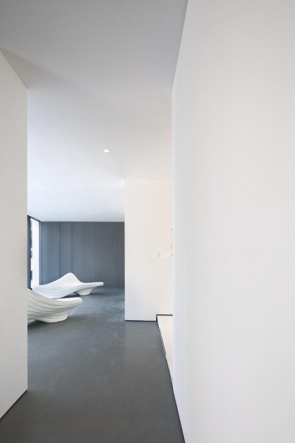
关于深圳的故事大多华丽,关于时间的讨论大多片面。颠覆固有印象和概念最好的做法,便是通过解构原语境,设置可供探讨的矛盾关系,焕发不同角度的思考。在不起眼的街角处,在有限的空间里,BLVD设计师以直白简练的语言,将原来的普通住宅重新塑造成一个亦庄亦谐的售楼展厅,不着一字而尽得风流。
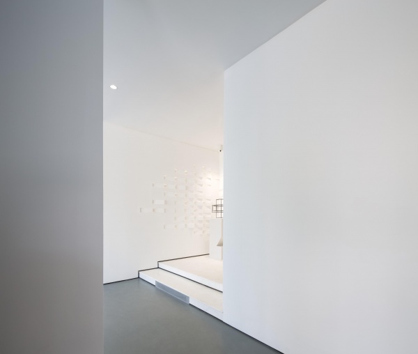
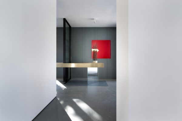
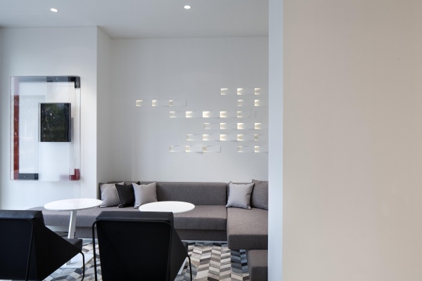
延续二期建筑体量的退进关系和块面旋转方式,室内墙面的几何形状重叠旋转,错位排列,微妙的灯光层次加深了空间的动态感,灯光方向增强了几何的抽象化,感官和视线被吸引带动,升华出整体纯净而统一的场景感和展示氛围。
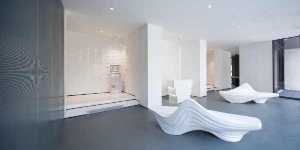
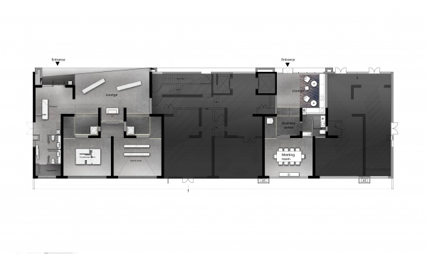
受原本建筑结构墙的限制,展厅与商务接待各有入口。为了营造连续的空间体验,设计师对部分外立面进行了改造。玻璃幕墙面向主干道轻微旋转,自然地形成展厅入口,如精致的橱窗一样吸引人们的视线。外厅与影音室、模型室之间的通道由于结构墙的存在显得狭窄,我们为此设置了台阶,增加了参观流线的趣味性。
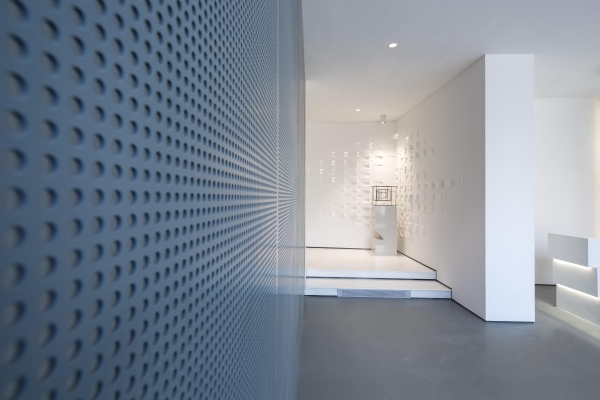
展厅采用了先进的三恒空调系统,在保证空间环保性和舒适度之余,也带来如何解决散热器美观和散热需求的难题。为此,墙面材料选用了充满未来工业设计感的穿孔铝板。转角处的旋转肌理细节则使用GRG材质,以避免出现太多缝隙,从而达到极简素净的效果。
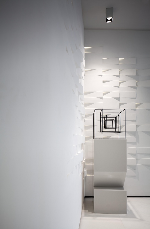
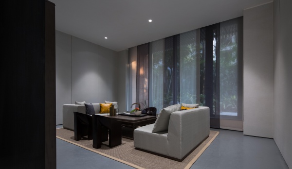
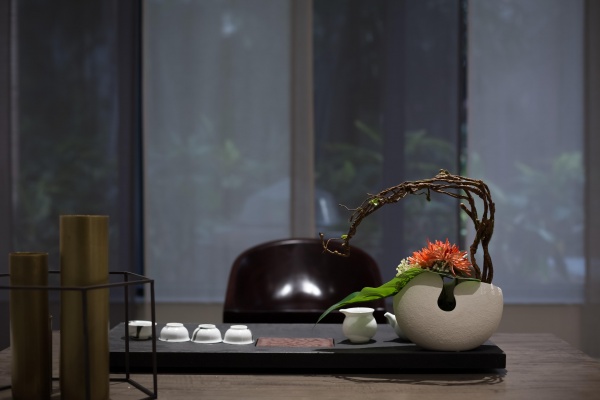
整体色调以白色为主。白色是最大的承载,以最开放的态度对待各种可能,最大程度地拥抱未来。极具动感的水吧和休闲椅,以亲切的姿态,鼓励客户和社区居民间的互动交流。连贯通透的各功能空间,经由不同形式的艺术品,转化为艺术现场。场所所蕴含的另一种深刻而细腻的情感,亦随之隐约可以感知。随处可见的休息凳,精心陈设的艺术装置,既表达了“心之安处即为家”的生活态度,又创造了驻足思考的契机。
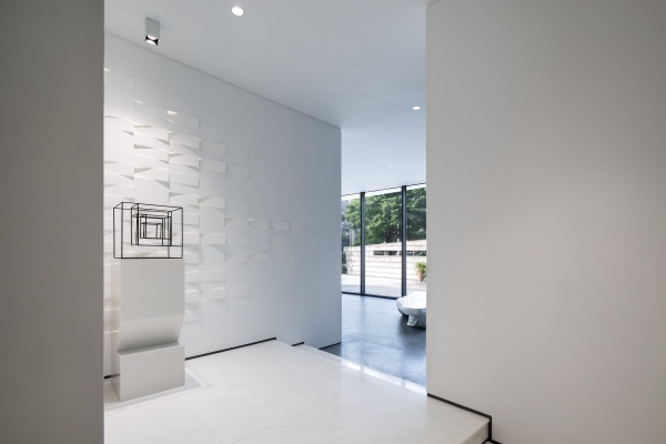
心之所向,无远弗届。如是所安,不畏将来,不念过往。在这解构了概念和定义的空间中,时空的边界就此消融,观者所能感受到的是生命律动和情感流转所带来的寂静和欢喜,是从容和淡然面对生活的勇气和智慧。
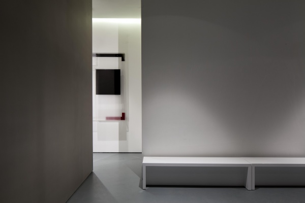
设计的复杂性和创造性体现于:从空间的角度来说,设计师不过是众多创作要素中最核心的一个,借由人为的创造,各种客观存在或偶然触及的元素得以整合,从而释放出纯粹自立的作品。海境界展厅正如它应有的样子,不仅展示了环保、现代、创新的企业精神,更随着使用者的探索和思考,转换成自由而宁静的精神空间。
【平面图】
【项目信息】
项目名称:深圳海境界展厅
建设单位:湾厦置业
项目面积:269平方米
项目地点:深圳
设计公司:深圳毕路德建筑顾问有限公司(BLVD)
设计师:刘红蕾、何海军、梁小梅、王庭、夏梦菡
摄影:欧阳云
【设计师】
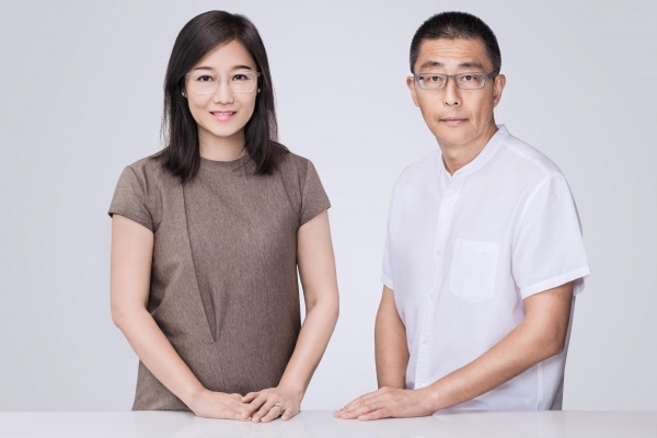
毕路德由杜昀先生和刘红蕾女士于2001年共同创立。“始于简单,止于至善”,源于对“至善和谐”理念的共同追求,十六年来,毕路德创作出一系列情、景、境相融合的设计精品,以国际化的现代语言重新诠释东方审美中推崇备至的“意境”之美,并通过自然、空间与人的相互对话,为观者带来无限遐思。兼具灵动的创意与严谨的学术精神, 开创“建筑、景观、室内”三位一体的全新格局,毕路德不仅在酒店设计与办公设计方面表现出类拔萃,亦是公认的中国最优秀的滨水设计专家。2017年,毕路德作为中国环境设计高端品牌,更吸引了启迪设计集团(300500)入股,双方通过各领域资源的整合,精致提供以文化创意为设计核心,具备开展建筑工程设计全业务流程资质和建设工程领域集成技术的高端一体化服务体系。
Shenzhen Mind the Sea Sales Gallery
I think there will always be a person, like me, standing between heaven and earth. We are separated by the distance of time and space, looking at each other, and feeling sympathetic. That's enough for me. – The Lost Horizon.
The new-type neighborhood construction in Shekou,Shenzhen is prosperous. Mind the Sea Phase I and Phase II, which separated by a street, were built in five years consecutively. When Phase I is still young, Phase II has already risen. It seems that a contrast perspective is introduced: the old and the new exist at the same time. So how to create an effective connection to eliminate the embarrassing situation of the old one and further present the life vision for the new one?
Most of the stories about Shenzhen are gorgeous, and most of the discussion about time is one-sided. The best way to subvert the inherent impression and concept is to deconstruct the original context, set up the contradictory relation to be explored, and reflect from different angles. At an unremarkable street corner and in limited space, BLVD designers reconstruct the original ordinary residential to a serious and facetious sales gallery with straightforward and concise language.
The architectural design concept is continued inside the space. The overlapping and staggered composition of the bricks creates a geometrical aesthetics on the wall; the subtle lighting layers gives the space a more dynamic impression; the illumination orientation even enhances the beauty of the geometrical abstraction of the space. Attracted and guided by the feature wall, one will be amazed by the pure and unified scenery and display ambience both sensually and visually.
Restricted by the solid walls of the original building, showroom and business chatting room have separate entrances. In order to create continuous space experience, BLVD designers reconstructed parts of the fa?ade. The glazed curtain wall,gently rotating to face the main road as if a delicate showcase, becomes the entrance of the sales gallery that attracts the view from outside. The steps on the long and narrow corridor connecting reception hall, AV room and modelling display room turns the otherwise long and narrow corridor into a very interesting visit journey.
The application of U-Home system in the sales gallery creates a more environmental-friendly and comfortable space experience. Well, it limits the use of wall materials – instead of luxurious upholstery or stone wall, the perforated aluminum board wrapping not only meets functional requirement but also gives the space a sense of futuristic industrial design. The use of GRG materials at corner area is not only a nice textured detail, but also help avoids eye-sore gaps and creates an elegant and minimal effect in the space.
The whole hue is mainly white. White is the biggest load, with the most open approach to face various possibilities and with the greatest extent to embrace the future.The gesture bar and leisure chair, with friendly attitude, encourage interaction between customers and community residents.Each coherent and transparent functional space, through different forms of art, become different art scenes. The deep and delicate emotions contained in the scene can be felt vaguely. The resting stools can be seen everywhere and the well-arranged artworks express the life attitude of "heart is home", and at the same time create the opportunity to think.
The direction of heart is not far away; the fear of future, and the reminiscence of the past have faded away. In this deconstruction of the concept and definition of space, the boundaries of time and space melt. What the viewer can feel are the rhythm of life and emotional circulation brought about by the silence and joy, as well as the courage and wisdom to calmly face life.
The complexity of design and creativity is reflected from the perspective of space: the designer is the most important one among numerous core creative elements. With designers’ creation, various objective existences and occasional elements can be integrated, thus releasing pure and independent works. Mind the Sea Sales Gallery, as it should be, not only demonstrates the spirit of environmental protection, modern and innovation, but also transforms into a free and peaceful spiritual space with the exploration and thinking of the users.
Project name: Shenzhen Mind the Sea Sales Gallery
Construction unit: Wanxia Real Estate Com., Ltd.
Project area: 269 sqm
Project location: Shenzhen
Design time: December, 2015
Completion time: November, 2016
Design company: BLVD INTERNATIONAL.
Key Designers: Liu Honglei, He Haijun
Participants of Design: Liang Xiaomei, Wang Ting, Xia Menghan
Photographer: Ouyang Yun
云燕装修
更多免费设计
免费提供多种设计方案
请输入您的称呼请输入手机号立即申请相关知识
新作 | 深圳海境界展厅:心之所向,如是所安
新作 | 深圳万科中心:环保节能和建筑充分融合的典范
森歌集成灶:心之所向,理想生活总少不了一个这样的你
箭牌蜡光砖:心之所向,无问西东
赣鄱设计联盟李朝晖:心之所向 未来可期
联邦米尼环保沙发:心之所安,为爱筑家!
联合精工吸油烟机:心有灵吸,自动导烟
SAKURA 樱花:心不唤物,物不至
一眼情迷恒福陶瓷新中式展厅:匠心之美,文化之魂
陈家旺:2018年的欧神诺,“心之所向,无问东西,加速前行”


